Most operating-model work starts in the wrong place: the org chart. This canvas starts where value actually gets made, in the services. It is a single-page template for designing or pressure-testing an operating model as a service model, tracing one clean line from a strategic choice to a stakeholder who is measurably better off.
Use it to map an existing operating model, to design a target operating model (TOM), or to check a proposed redesign before it becomes a reorg. It takes a working session with the right people, not an afternoon alone, because the numbers and choices it asks for come from the room where strategy lives.
Download the canvas: Service Operating Model Canvas (PDF, print landscape) · high-resolution image (PNG)
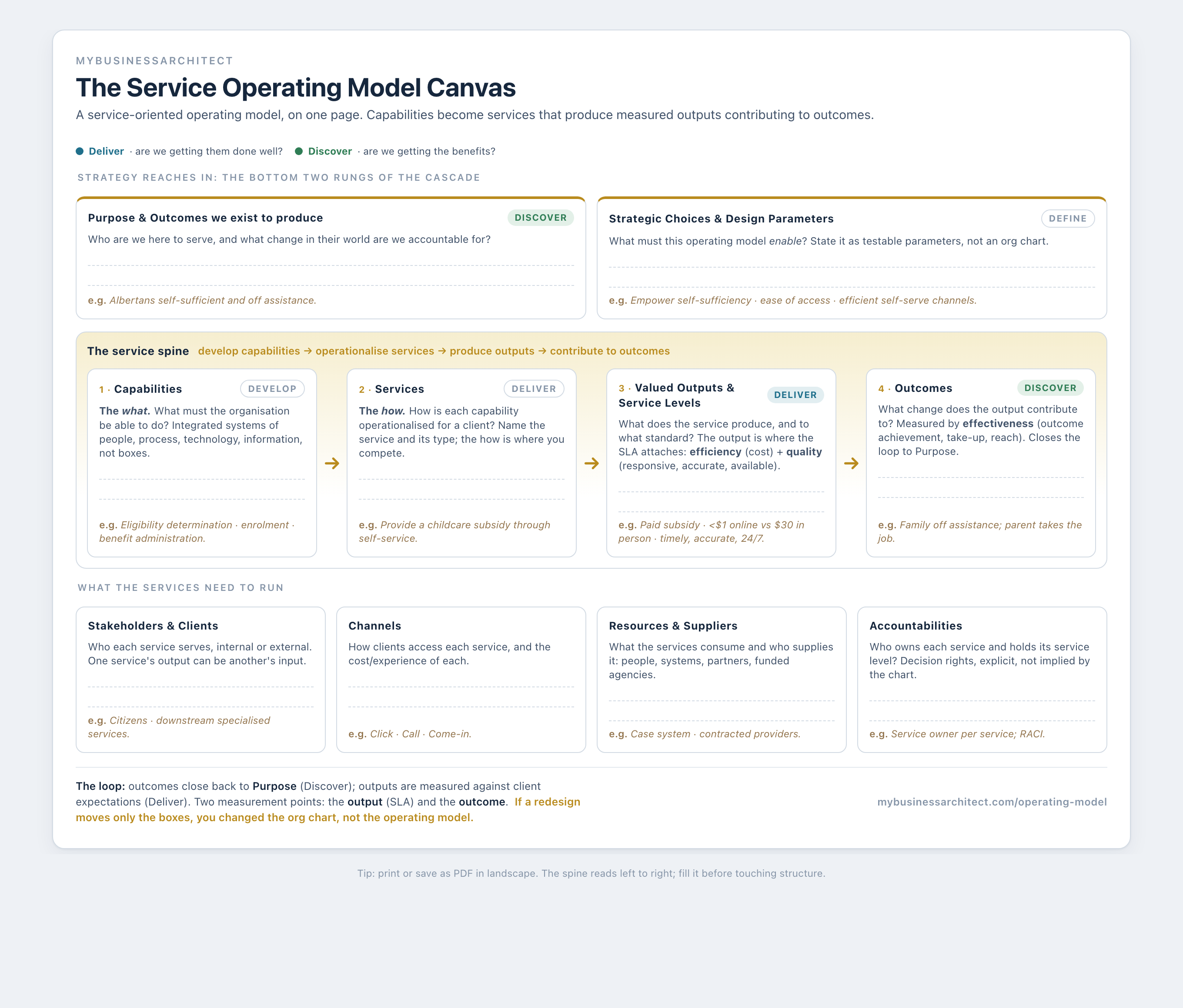
What the canvas is for
An operating model is the machinery that turns a strategy into outcomes: the arrangement of capabilities, services, processes, information, technology, and suppliers that produces the results the strategy promised. The operating model pillar makes the full argument for why a service model beats the org chart at that job. This canvas is the instrument. It puts the whole machine on one page, organised around the flow that matters:
Capabilities (the what) → Services (the how) → Valued outputs and service levels → Outcomes.
Read left to right, that's the spine of any operating model that works. The canvas surrounds it with the few supporting blocks the services need to run, and closes with the loop back to purpose. Fill it honestly and you can see, in one view, whether your operating model is a service model that delivers or an org chart with ambitions.
How to use it: the walk
Take the blocks in this order. The order matters, because each block constrains the next.
1. Purpose and outcomes (top strip, Discover). Start with the change you exist to produce. Who do you serve, and what is different in their world when the operating model works? Not activities, not outputs. The outcome. If you can't state it, nothing downstream can be judged, only counted.
2. Strategic choices and design parameters (top strip, Define). Translate the strategy into what the operating model must enable, stated as testable parameters. "Empower self-sufficiency." "Ease of access." "Use efficient self-serve channels where clients have the capacity." These are the criteria every design choice below gets tested against. Skip this block and the redesign has no test, which is exactly how an operating model quietly becomes an org chart.
3. Capabilities (spine, the what, Develop). List the capabilities the strategy requires: the things the organisation must be able to do, each realised through people, process, technology, and information. Keep this short. You are naming the handful the strategy actually depends on, not cataloguing everything.
4. Services (spine, the how, Deliver). For each capability, name the service that operationalises it for a client. This is where the how lives, and the how is where you compete: the same capability delivered through a better service is most of what "transformation" actually means. Name the service type if you can, because the type carries a reusable pattern of activities and metrics.
5. Valued outputs and service levels (spine, Deliver). State what each service produces, and to what standard. The output is where the service level attaches, measured on two families: efficiency (cost per transaction) and quality (responsiveness, accuracy, availability, reliability, simplicity). This is your answer to "are we getting them done well?"
6. Outcomes (spine, Discover). Connect each output back to the outcome from block 1. An output contributes to an outcome directly or through the services it feeds. Measured on effectiveness (outcome achievement, take-up, reach). This is your answer to "are we getting the benefits?", and it closes the loop.
7. The supporting band. Fill the four blocks the services need to run: stakeholders and clients (internal or external, since one service's output is another's input), channels (how each service is accessed, and the cost of each), resources and suppliers (what the services consume and who supplies it), and accountabilities (who owns each service and holds its service level, stated explicitly rather than implied by the chart). The services that keep these services running, such as IT, recruitment and procurement, are support services: their clients are the providers of the services on this canvas, and their outputs often arrive here as resources. List them under resources and suppliers, or give one a canvas of its own when the strategy depends on it.
8. Read the loop, then apply the test. Trace it back: outcome fulfils purpose, output meets the service level, service operationalises the capability, capability was required by the strategic choice. Then apply the one test that separates a real operating model from a reorg: does any proposed change move a lever other than structure? If the redesign only moves boxes, it changed the org chart, not the operating model.
A worked example: a childcare subsidy
Here is the canvas filled for one real public-sector service, the example that runs through the operating model pillar.
| Canvas block | Filled in |
|---|---|
| Purpose / outcome | Families become self-sufficient and no longer need assistance |
| Design parameters | Empower self-sufficiency · ease of access · use efficient self-serve channels |
| Capability (what) | Eligibility determination · enrolment · benefit administration |
| Service (how) | Provide a childcare subsidy through self-service |
| Output + service level | An authorised subsidy paid monthly. Efficiency: under $1 per transaction online vs ~$30 in person. Quality: timely decision, accurate, available 24/7, completed unassisted |
| Outcome | The parent takes the job; once income is steady, the family is off assistance |
| Channels | Click · Call · Come-in |
| Accountabilities | A named service owner holds the service level for the subsidy service |
The reflexive alternative would have been to move the childcare-subsidy team under a new division: a change to the accountabilities block and nothing else. The canvas shows why that changes nothing the parent experiences. The service, the output, and the service level are where the redesign had to happen. For four more worked examples across an airline, a bank, a hospital, and a college, see the operating model examples.
How this differs from the org chart, and from other canvases
Versus the org chart. The chart shows reporting lines. This canvas shows how a request becomes a delivered result and whether anyone is better off for it. Structure is one block on this page (accountabilities), and the least strategic one. If a redesign only touches that block, it's a reorg, not an operating-model change.
Versus a domains canvas. Other operating-model canvases organise the page around domains (process, information, location, organisation, suppliers, management systems). Domains describe what an operating model contains. This canvas organises around the service flow, which describes how the operating model works and how it gets measured. The domains still appear here (as resources, channels, and accountabilities), but as inputs to the services rather than the organising idea.
Versus a benefits register. A register lists intended benefits. This canvas forces each one back to the service and output that has to produce it, which is what keeps outputs (service levels green) from being mistaken for outcomes (anyone actually better off). That distinction is the whole of benefits realization seen from the service side.
Common mistakes the canvas catches
- A spine with services but no outcomes. Outputs with nothing in the outcome column is Measurement Theatre waiting to happen: service levels green, nobody better off.
- Design parameters that are goals, not criteria. "Improve customer experience" is a wish. "Any client can complete this service unassisted in under ten minutes" is a parameter you can test a design against.
- Everything a capability, nothing a service. If the whole page is capabilities, the how hasn't been designed, and the operating model is still just a list of things you can theoretically do.
- Accountabilities filled first. Starting with who owns what is starting with the org chart. Fill the spine first; let structure follow the services, not the reverse.
Frequently asked questions
What is an operating model template? An operating model template is a structured, reusable framework for mapping how an organisation delivers its strategy: its capabilities, services, outputs, and the outcomes they produce. This canvas is a one-page template organised around the service flow, so a team can design or pressure-test an operating model in a single working session.
What is a service operating model canvas? A service operating model canvas is a one-page template that designs an operating model as a service model. It maps the capabilities an organisation has (the what), the services that operationalise them (the how), the valued outputs and service levels each service produces, and the outcomes those outputs contribute to, plus the stakeholders, channels, resources, and accountabilities the services need to run.
How is this different from the Business Model Canvas? The Business Model Canvas describes how an organisation creates and captures value (customers, value proposition, revenue). The Service Operating Model Canvas describes how it actually delivers that value: the capabilities and services that turn the proposition into running, measured operations. The business model is the summary; the operating model is the detail that makes it real.
Can I use it for a target operating model (TOM)? Yes. Fill it for the future state and it becomes a one-page TOM: a blueprint of the capabilities and services the strategy requires, with the outputs, service levels, and outcomes they must hit. Anchor it in the design-parameters block and pressure-test it against real stakeholder scenarios before it drives a roadmap.
Companion reading: Operating Model Examples: Why the Service Model Beats the Org Chart. The service-oriented operating model sits in the Design4 framework at Develop and Deliver, and is taught in Closing the Strategy-Execution Gap.